The Texas Rangers have unveiled their latest City Connect uniforms, and they present a fascinating challenge: how do you follow up a design that was almost too good? The team's inaugural City Connect set, with its iconic Peagle mascot, deep historical nods, and "Dream the Big Dream" slogan, set an incredibly high bar. It was a complete, thoughtful package that resonated immediately with fans.
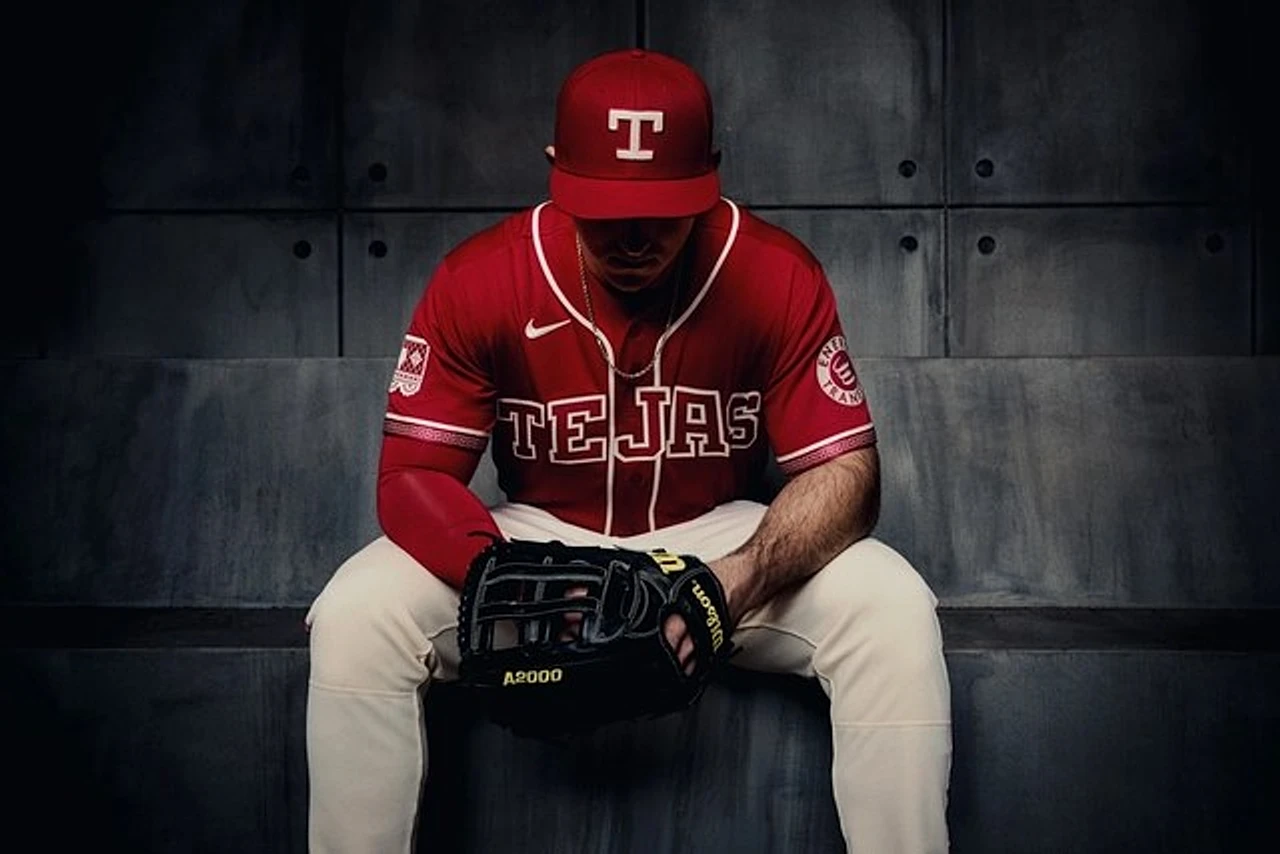
This new edition, themed "Reimagining Tradition," aims to honor the rich Tejano culture of Texas. While the intent to celebrate the blend of Mexican-American heritage is commendable, the execution feels less cohesive than its predecessor. The initial photographic reveals conveyed a more subdued tone than the "celebration" the design seeks to embody.
Visually, the jersey features a distinctive, deep crimson red—a shade that sits between the previous City Connect red and the classic Rangers uniform color. Some of the most intriguing details, however, are subtle to the point of being hidden. A beautiful patterned inlay within the lettering is virtually invisible from a distance, which is a missed opportunity for on-field flair.
Where the design truly shines is in its finer craftsmanship. The sleeve piping incorporates a clever "charro" pattern created from repeating the Rangers' block "T" logo—a brilliant fusion of team identity and cultural homage. Even better is the patch on the sleeve, where the Texas flag normally resides; it's been replaced with delicate "papel picado" cut-paper art, a thoughtful and respectful nod to the cultures being celebrated.
Ultimately, this uniform is a story of impressive details in search of a more powerful whole. It possesses thoughtful touches that dedicated fans will appreciate, but it struggles to make the same bold, immediate statement as the legendary set that came before it. The block "T" remains a strong centerpiece, but the dream this time feels a little quieter.