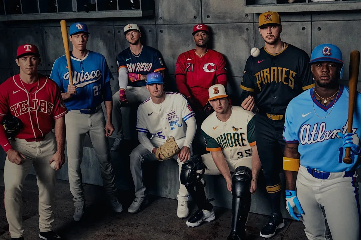
The 2026 MLB season has arrived, and with it comes a fresh wave of City Connect uniforms. In a coordinated Thursday rollout, eight teams unveiled their latest designs, each aiming to capture the unique spirit of their city. As always, the results are a mixed bag—some are instant classics worthy of a permanent spot in the rotation, while others might leave fans scratching their heads. Let's dive into the rankings.
Leading the pack are the Texas Rangers. Their uniform is a vibrant celebration of regional heritage, anchored by a rich cochineal red. The "Tejas" chest wordmark, charro-embossed belt details, and mariachi-inspired patterns create a cohesive and culturally resonant design that stands out for all the right reasons.
On the opposite end of the spectrum, we find the Los Angeles Angels. While they avoid the fate of the Dodgers' infamous "Los Dodgers" misstep, this design unfortunately lands in generic territory. The overall aesthetic feels more suited for a college diamond than the big leagues, lacking the distinctive flair the City Connect program promises.
Slightly above them are the Chicago White Sox. This uniform is saved by its meticulous details. From the artistic sleeve graphics to the textured hat logo and thoughtful trim on the sleeves and pants, there's more here than meets the eye. It's a package that grows on you, even if the first impression isn't overwhelming.
The Milwaukee Brewers present a complex case. Their design beautifully evokes Wisconsin's natural landscape with a water-toned base, cream accents, and a gradient wordmark mimicking summer sunsets. Nods to history, like the redesigned Barrelman patch, are clever. However, the central "Wisco" wordmark feels like a forced nickname that doesn't quite resonate locally, holding back an otherwise creative endeavor.