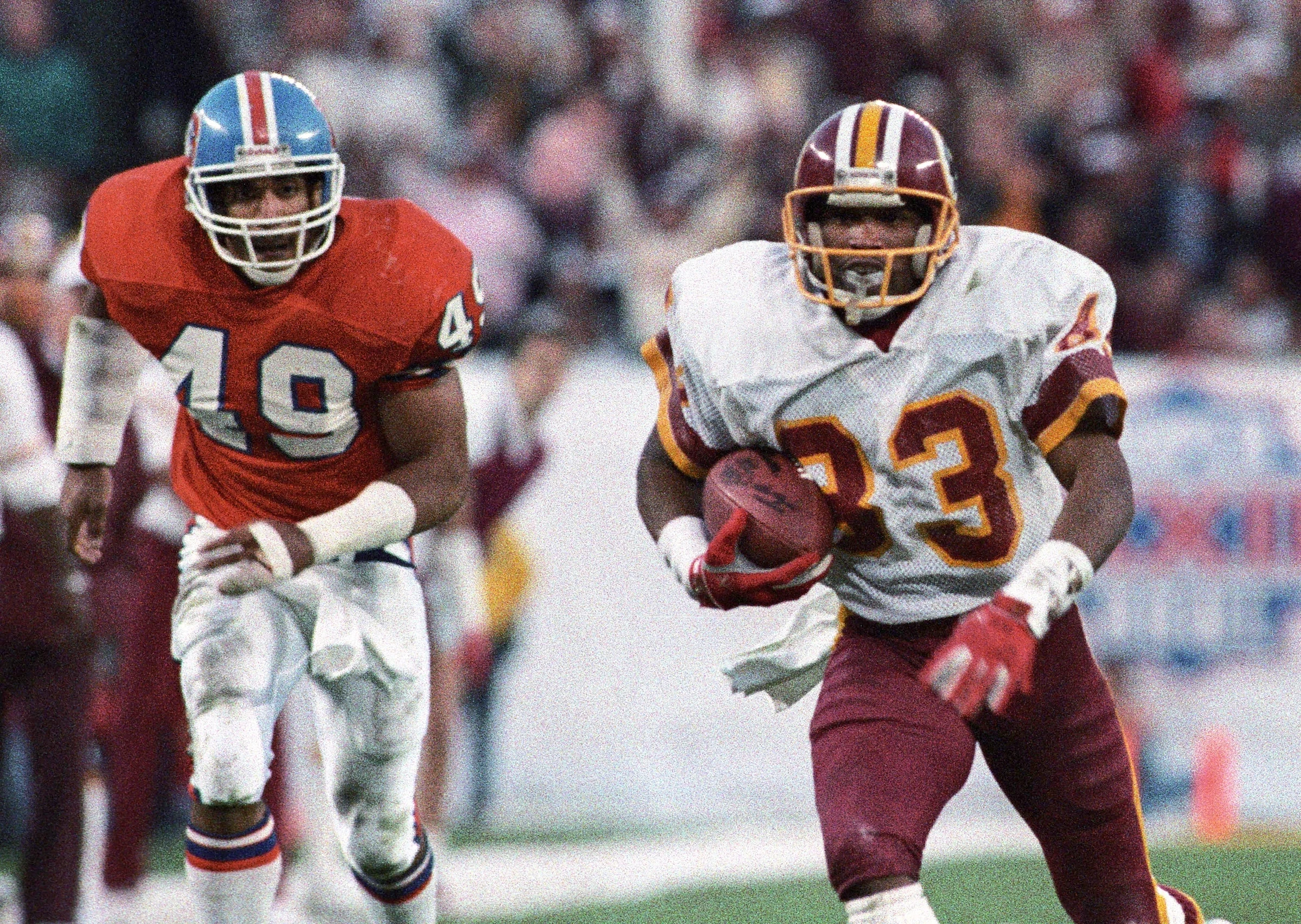
The Washington Commanders have officially unveiled their new uniforms for the 2026 season, and the design is a powerful nod to the franchise's storied past. Stripping away the generic, stenciled aesthetic of their initial "Commanders" era, the team has returned to the iconic burgundy and gold color scheme that defined its championship legacy.
This isn't just a minor tweak; it's a seismic shift in identity. The new kits feature big, bold numbers, classic color-splitting stripes, and strong contrasts that immediately evoke the glory days of the 1980s and early '90s—a period that yielded three Super Bowl victories. It’s a look that marries modern fit with timeless design, finally giving fans a uniform worthy of the team's history, but without the offensive imagery that once marred the helmet.
The move is part of a broader league-wide trend of embracing classic aesthetics, similar to the Tennessee Titans' recent return to their beloved powder blue roots. For years, Washington's uniforms languished near the bottom of NFL rankings. This redesign, focused on the best elements of the past, promises to change that narrative entirely.
While the primary set is a clear home run, the alternate uniform offers a more experimental blend. It merges the franchise's old spear motif with the contemporary folded "W" logo, set against a black background. It serves as a interesting contrast, highlighting just how effective and resonant the straightforward classic approach truly is.
For fans and sports apparel enthusiasts, this reveal is significant. It demonstrates how a return to foundational design principles—bold colors, clean stripes, and historical connection—can create a uniform that feels both fresh and deeply authentic. The Commanders aren't just changing their clothes; they're reclaiming a visual identity that resonates with victory and tradition.