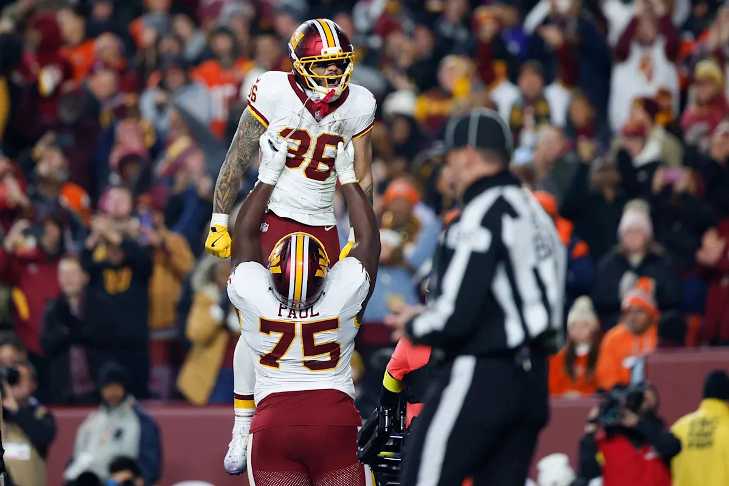
The Washington Commanders have officially pulled back the curtain on their 2026 uniforms, and the early consensus is a wave of approval. The new look, unveiled Wednesday, smartly taps into a rich vein of nostalgia, drawing clear inspiration from the classic 90s-era designs that long defined the franchise. It’s a welcome pivot that seems to resonate deeply with the fanbase.
So, did they finally get it right? To break it down, we turned to insights from uniform specialist Zach Cohen of FanDuel, who has a keen eye for NFL aesthetics. His initial verdict? A "drastic improvement."
Cohen highlights several key upgrades. The return of gold pants is a celebrated, classic touch. The organization also made a savvy switch to a glossy helmet shell, a move that better captures the iconic look of their Super Bowl era—the clear foundation for this entire redesign.
The most talked-about element is the new alternate "Hail Raiser" uniform in black. While Cohen questions if a black set is entirely necessary for the Commanders' identity, he concedes it pushes the brand in a fresh direction and, crucially, is "definitely better" than the previous black alternate. The design, featuring a spear through the 'W' on the helmet, has been widely applauded by fans for its sharp, modern execution.
The away uniform remains the popular white throwback jersey from last season, offering a consistent and clean look. Overall, this rollout feels like a cohesive and thoughtful step forward. It honors the past while refining the team's visual identity for the future, leaving many to wonder if this is the definitive look Commanders fans have been waiting for.